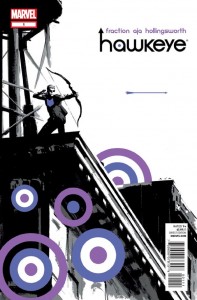
 Hawkeye #1 — Writer: Matt Fraction; Art: David Aja
Invincible Iron Man #522 — Writer: Matt Fraction; Art: Salvador Larroca
Defenders #9 — Writer: Matt Fraction; Artists: Jamie McKelvie with Mike Norton
Three by one of Marvel’s top go-to writers. If Hawkeye’s creative unit feels familiar, that’s because Fraction and Aja were teamed (along with co-writer Ed Brubaker) on the cult favorite Iron Fist a few years ago, and since then they’ve only gotten better. This reminds me a lot of the 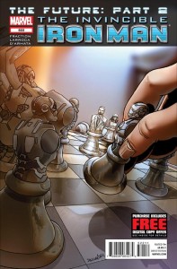 sublime Daredevil, with its very clean, clear art, its masterful use of small panels to make the narrative flow smoothly, its firm grasp on the qualities that make its main character a hero, its trust in its readers’ intelligence (there are a number of time jumps, but they’re easy enough to put together) and, above all, its overwhelming sense of fun. In a week with an embarrassment of comics riches, it’s the best of the bunch. Iron Man is similarly blessed, with Fraction/Larroca having worked together on the book for years now; it’s in the middle of wrapping up its last big story (before a “Marvel Now!” restart with new creators in a few months),
 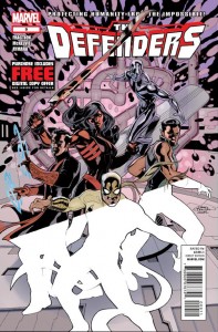 and we’ve got a chillingly-in-charge Mandarin, a mind-controlled, enslaved Tony, Pepper and Rhodey in various metal suits, and a whole bunch of moving parts and conflicts that promise to come together in an explosive finale in just a couple of issues. Meanwhile, in The Defenders, another book with a good artist in Jamie McKelvie, there’s a reality-warping Concordance Engine, an alternate-dimension ’60s Nick Fury, Agent of S.H.I.E.L.D. Steranko tribute, and enough snarky dialogue and weird goings-on to keep everything interesting. This is the least of the three titles (and the one most in trouble, sales-wise), but between its unusual cast of characters and its strange little touches (like the little messages at the bottoms of the pages, sometimes just ’70s-style promos for other titles and sometimes… something more), it’s definitely worth a look.
Daredevil #16 — Writer: Mark Waid; Art: Chris Samnee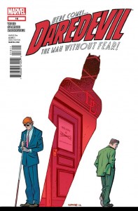
Speaking of Daredevil… this is a bridge issue, resolving Matt’s Latverian-caused nanobot problems from the last arc and setting up new conflicts, so it doesn’t have quite the oomph of some of the previous books, but Waid still manages to get in an origin recap, a Fantastic Voyage-like trip by Hank Pym into Matt’s head that reveals something about the character of both men, and a poignant partnership breakup heralded by the cover. Then, there’s the art by Samnee — and everything I said up above about Aja’s art applies here too (the letters page announces that next issue will have a fill-in artist — but since it’s Mike Allred, this comic’s winning streak with its pencilling looks like it’ll stay nicely on track).
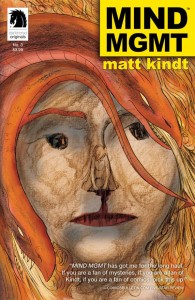 Mind Mgmt #3 — Creator: Matt Kindt
In which dolphins deliver Chinese travel destinations, Meru’s inexorable pursuers keep killing off characters and getting closer, and she finally meets Henry Lyme, the man who knows about the grand conspiracy she’s investigating. Next issue: some actual answers, presumably. Much of the fun in this comic continues to be all the little subliminal extras: the writing down the sides of the pages, the back-issue ad that isn’t an ad, the letters-page clues, the website… and Kindt’s art, which, like the story, looks simple (even childish) on the surface, but reveals new and unexpected strengths and layers as you dive deeper into it. If you’re tired of cookie-cutter comics creations that all look the same, this careful, cool alternative is the book for you.
The First X-Men #1 — Writers: Neal Adams and Christos Gage; Art: Neal Adams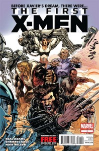
Worth noting for the Adams art, of course. It’s… interesting that Gage is on board; after the solely-Adams produced Batman: Odyssey — which was, literally, unreadable — one wonders how much Marvel had to push to get an actual writer in there to clean up the syntax and make the pretty pictures make sense. In any event, it worked — there’s a reasonably linear narrative, with reasonably-clear motivations and only a few “huh?” moments (the way everyone refers to Xavier as a kid, when he looks just like the current-issue Professor X, except that he’s pre-wheelchair; the way Adams draws Sabertooth’s fang-filled mouth — and, in fact, everyone’s mouth, because they all seem to have weird dental implants. Maybe that’s why they all stand around with their mouths open all the time, because their teeth are so weird that they can’t close them?). It’s strange to say so about someone so influential, but in a week that features artists like Klindt, Samnee, Aja, et.al, Adams seems like the old fogey, a huge talent relying on timeworn tricks that the comics world has long-since moved beyond.
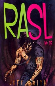 RASL #15 — Creator: Jeff Smith
The finale — 48 pages for $4.99, which makes Marvel’s 20-pages-for-$3.99 standard seem usurious, even if their books are in color — and it features double-crosses, twists, deaths and an ending that’s suitably open-ended (the last image is of our hero setting off to face an uncertain future, exploring a world that’s not quite his own), given the multiversal themes at play here. This is a story that will repay being read all at once, to see just how Smith has put together his plot and forecast the various reveals and themes — for now, though, it feels like it worked fine, and was a daring, completely different change of pace from Bone; let’s pause to give Smith credit for that successful changeup, and to look forward to whatever he might decide to create for us next.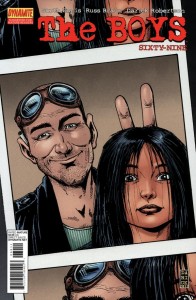
The Boys #69 — Writer: Garth Ennis; Art: Russ Braun
The Shadow #4 — Writer: Garth Ennis; Art: Aaron Campbell
Fury Max #5 — Writer: Garth Ennis; Art: Gorlan Parlov
Another trio of books from one author, although these don’t display quite the range of mood and technique that Fraction’s do; they’re all pretty much farming the same 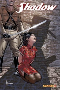 land. That’s OK, though, because it’s fertile territory; Boys has been the most fantasy-oriented, with its overly-superpowered world, but this antepenultimate issue offers little of the satiric or splashy fun of some earlier episodes; it’s murderously serious, as its hero faces an increasingly-deadly and enigmatic foe. The Shadow is much sunnier, even given its shadowy hero, because we know that he’s going to come out on top eventually; the delight is in watching his ’30s-era pre-WW2 antagonists show how competent and
 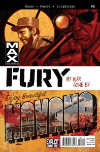 ruthless they are, knowing that they’ll meet their match in another issue or two (this issue has four covers, in equal measure. If you can, get the Chaykin one; even though it offers a scene that never appears in the actual comic, it’s nice to see the artist revisiting a character that he revived so memorably in the ’80s). Fury is the most realistic (the Max-world Nick has no superheroes in sight), and puts its war-weary hero smack in the middle of the Bay of Pigs; even though we know he’s not going to assassinate Castro, watching him try, and deal with various reasonably-historically-accurate government screw-ups along the way, makes for entertaining reading.
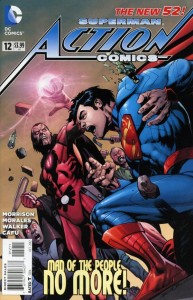 Action Comics #12 — Writer: Grant Morrison; Pencils: Rags Morales, Cafu and Brad Walker; Inks: four people
Many threads start to come together here (we all knew that was going to happen, given Morrison’s style), as Captain Comet does the opposite of saving the day, while Batman shows Clark why his “death” was a bad idea, and that plot development looks like it’ll get resolved courtesy of a fifth-dimension deus ex machina (but not one named Mxyzptlk; Morrison seems to have bigger forces at work here than just one imp). Given the news that he’ll be leaving the title in six issues, it’ll be interesting to see just how everything resolves: perfectly, as with All Star Superman, or kind of strangely and not-quite-clearly, as with Final Crisis? Stay tuned….
iZombie #28 — Writer: Chris Roberson; Art: Michael Allred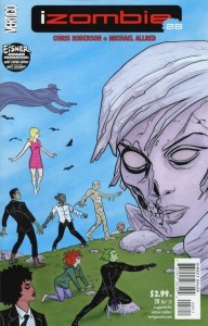
The last issue, and one that brings a definite end to the story; I’d love to know whether Roberson ended it on a preset schedule here, or had planned to string it out longer, and only went to his endgame when the book’s cancellation seemed imminent. As fizzy, ’60s-mod entertainment written to Allred’s strengths, it worked very well, but if anything it may have gone on too long; limiting it to, say, 12 issues from the start might have focused things better, and cut down on some of the wandering-around, what-should-we-do-now vibe that started to seep into the book after its first year. Still: Allred art, and with a suitably-’60s tribute to Steve Ditko on the trippy last page.
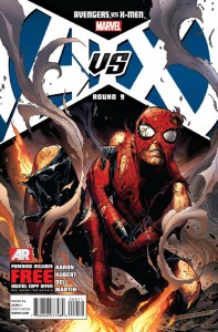 Avengers Vs. X-Men #9 (of 12) — Script: Jason Aaron; Pencils: Adam Kubert; Inks: John Dell
This issue represents the 75% point, and things begin to round the last turn and enter the final stretch. I’m a sucker for Spider-Man spotlight issues, too, especially the bit where he’s facing impossible odds but, like Captain America or Batman, just refuses to give up. I’m still not sure that the whole Phoenix plot makes a lot of sense (the rules of how it goes from one force to five parts to four to, by the end of this issue, two aren’t very clear), but asking for rock-solid logic in a summer blockbuster event created by a five-writer committee seems besides the point (hey: five writers; five parts to the Phoenix force — a little wish-fulfillment projection there, guys?). In any case, it’s best with these things to just shut up and enjoy the ride — and, judging by sales, most readers have decided to do just that; let’s hope the ending is worth it.
Black Kiss 2 #1 (of 6) — Creator: Howard Chaykin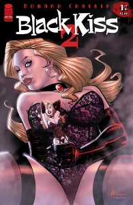
The first Black Kiss was an ’80s 12-issue adult series by Chaykin — very adult, especially for the time period — about one of his typically Reuben Flagg-like protagonisst battling movie-star vampires. This one is something of a prequel, and ups the adult ante even more, with more female nudity and erect male organs than you can shake a… well, never mind; that’s not an analogy that can go anywhere good. The book itself is similarly wince-inducing, at times, but it’s also undeniably well-written, and very well-drawn; a lot of the fun is watching Chaykin’s rendering of the early-20th-century costumes, architecture and other props at the dawn of the motion-picture era. Just don’t leave this book where relatives or anyone else with conservative tastes might find it, unless you’re a fan of raised eyebrows and stammered explanations.
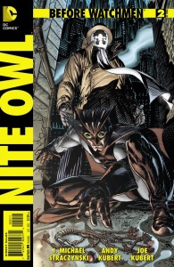 Before Watchmen: Nite Owl #2 (of 4) — Writer: J. Michael Straczynski; Pencils: Andy Kubert; Inks: Joe Kubert
Unlike brother Adam over in Avengers Vs. X-Men, Andy gets father Joe to ink his pencils here, giving the cityscapes and faces an old-school look that works well with the book’s early-’60s time period. The story tries to get some character momentum going with parallel flashbacks to its heroes’ childhoods, but there’s a chase-the-perp scene that ends up in an S&M dungeon, in a weird echo of Pulp Fiction (except that this one involves a sexy dominatrix for Nite Owl to talk to, instead of Nazi hillbilly rapists), and the whole thing comes off as grim and exploitive and silly, with only an occasional flash of the kind of mismatched buddy-superhero-partners story that might have actually been fun to read.

