 Descender #1 — Writer: Jeff Lemire; Art/Colors: Dustin Nguyen
Hawkeye #1 — Writer: Jeff Lemire; Art: Ramon Perez; Colors: Ian Herring with Ramon Perez
Two first issues by writer Jeff Lemire this week — one corporate-owned, and one creator-owned. Descender, the creator-owned one, is a science-fiction tale about giant killer robots who, ten years ago, devastated a planetary system and led to widespread fear and discrimination against all machine-based life. Its main character is a young boy, the only survivor of a mining colony disaster, who awakens ten years after that and… well, at first he seems like Jonny Quest (he even has a robot dog named Bandit), but later seems more like Astro Boy; to say any more would give away a major twist 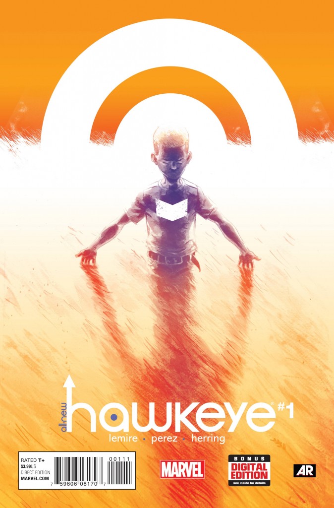 halfway through the first issue. As always with Lemire, this is smart, human (even if it’s mostly about robots), and very well constructed; Nguyen’s use of pastel watercolors gives it a dreamy, fairy-tale style that’s attractive and good at communicating the action, and this is an effective first chapter in the story. So too with Hawkeye, where Lemire and artist Perez have the thankless task of following the acclaimed Matt Fraction/David Aja run on that Avengers character. This first issue offers two parallel stories: one about Clint and Barney Barton as kids, done in sketchy, dreamy pastels much like Descender, and the other a present-day adventure with Clint and “other” Hawkeye Kate Bishop, done in the brightly-colored, minimalist style of Aja (and many other artists at the moment); the two narratives are often on the same page, but their distinct styles keep them easily separated, and are a tribute to Perez’s flexible, chameleonlike skills — not many single artists would have been able to deliver that effect. As with Descender, if a first issue is measured by its ability to bring readers back for a second issue, both of these deserve to do very well.
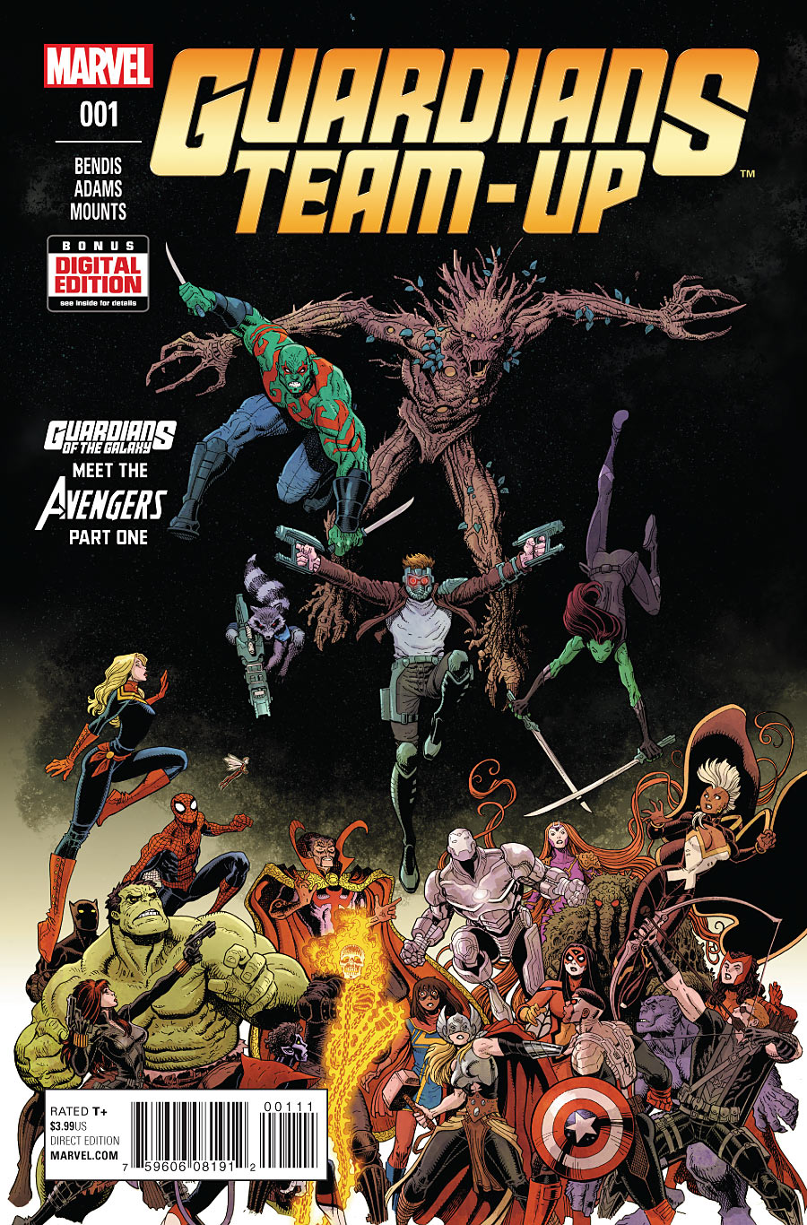 Guardians Team-Up #1 — Writer: Brian Michael Bendis; Pencils: Art Adams; Colors: Paul Mounts
I almost passed this up — who needs another Guardians book? — and didn’t realize until I opened it that the “Adams” listed on the cover is Art Adams, who provides pencils and colors (and no need for an inker, since the coloring is enough, and leads to an appealingly lush, layered and subtle style). Few other artists could have handled all the characters involved here (I count 24 just on the cover), and make them all so good-looking and individual; Adams is an old pro and a national treasure, and his presence alone is enough to justify getting this comic — add in Bendis’s light-touch script, which gives Adams plenty of room to breathe and matches his style well, and darned if we didn’t need another Guardians book, at least if it was going to be this much old-school fun.
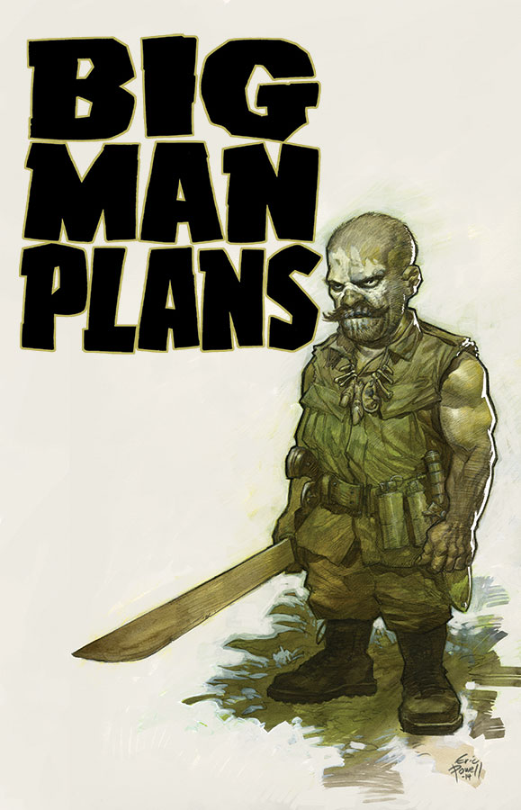 Big Man Plans #1 (of 4) — Writers: Eric Powell and Tim Wiesch; Art: Eric Powell
This is one of Powell’s side projects, unrelated to The Goon, although it has that title’s love for the grotesque and the violent; it’s about a little person/midget/dwarf (he’s called all those things, and more, in the comic), a former tunnel rat in Viet Nam, who’s absolutely not to be messed with — and yet, people keep trying to mess with him anyway, which looks like it’s going to lead to a lot of Very Bad Outcomes. Not for the faint of heart (co-writer Wiesch, in the editorial matter, calls it “dirty, dark, and frankly kind of f***ed up”) or the prudish (midget genitalia…), but a good example of Powell’s EC-grounded knack for horror and gritty, two-fisted suspense.
 Project Superpowers: Blackcross #1 — Writer: Warren Ellis; Art: Colton Worley; Colors: Morgan Hickman
Supreme: Blue Rose #7 (of 7) — Writer: Warren Ellis; Art/Colors: Tula Lotay
Two by Ellis — Blackcross is a first issue, and involves his take on some of the Project:Superheroes characters: it’s the name of a small Pacific Northwest town where strange things are happening (a local douses himself in gasoline, sets himself on fire and walks into a lake; a fake medium is haunted by apparitions in her mirrors; a man in witness protection keeps dreaming about a ghostly Black Terror and getting mysterious text messages), as something terrible that happened in the past, or in some other reality, is starting to leak through into the present. That’s not far from the plot of Supreme: 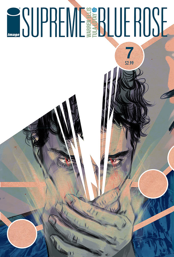 Blue Rose, which has had a reporter investigating mysterious doings in another small town, with other ghostly apparitions, and which offers its finale this week. Ellis has always been good at the surreally-menacing tone so prominent in both of these books, and at coming up with convincing quantum physics/babble to eventually explain them; Supreme’s ending struck me as a little too pat, but the art and coloring in this series, from the astonishing Tula Lotay, have made it sing: over in Blackcross, Worley and Hickman aren’t quite on that level, but still do a good job establishing the eerie, dreamlike atmosphere that’s required — and readers should get this book’s alternate cover, pictured here, because that’s by Lotay, too, and well worth a look (standard reminder: click on the thumbnails here to see a larger version of each cover).
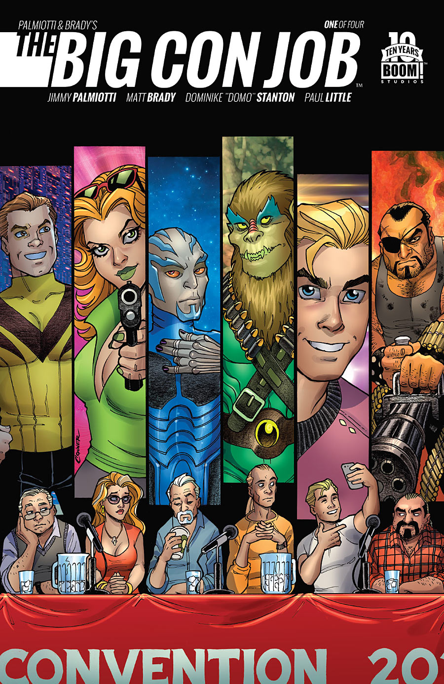 The Big Con Job #1 (of 4) — Writers: Jimmy Palmiotti and Matt Brady; Art: Dominike “Domo” Stanton; Colors: Paul Little
This is a caper comic: the aging cast of a long-ago cult TV sf show (Star Trek, but not Star Trek…) are eking out a living doing autograph signings and con appearances, with no prospects, until they’re approached by a mysterious stranger who promises them a big payday if they’ll help him rob… the San Diego Comic Convention. That’s pretty much the first issue (not much of a spoiler, since I suppose it’s implied in the book’s title); Palmiotti knows how to establish character, and ramp up the pathos, and he has an insider’s view of the con circuit that makes these faded celebrities’ indignities all sound both sad and believable. Stanton’s art is OK (he has the unenviable job of trying to match Amanda Connor’s cover art, and while he’s good at composition and storytelling, it’s in a more minor key than hers); the intriguing premise alone should be enough to bring readers back for the next three issues.
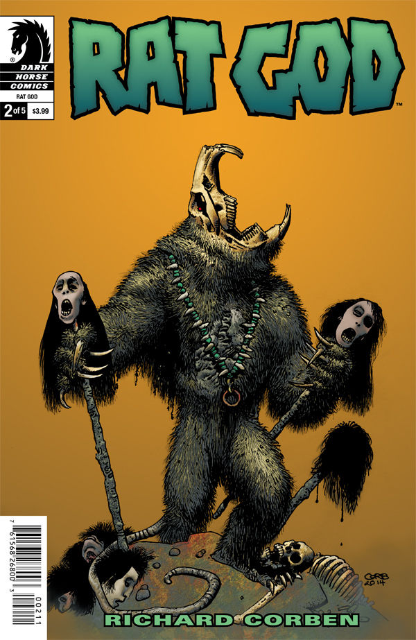 Rat God #2 (of 5) — Writer/Artist: Richard Corben
Corben offers the second installment of this mini-series, set in the 1920s in a vaguely Lovecraftian New England (the not-particularly-pleasant young man who’s the protagonist says things like “C’thulhu’s breath!,” and is searching for a lost love in a remote, forbidding town where everyone look half-rodent; I think, from the title and the cover, we can all see where this is going…). Although not that much actually happens in this issue, the pleasure is in the journey, and in watching Corben run all of the HPL riffs through his very precise, otherworldly-looking style.
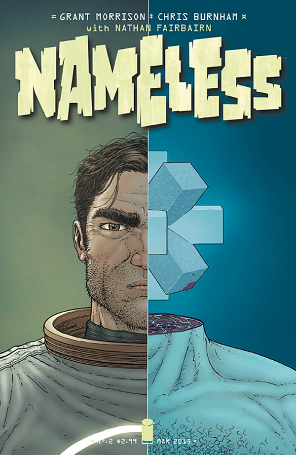 Nameless #2 — Writer: Grant Morrison; Art: Chris Burnham; Colors: Nathan Fairbairn
Speaking of Lovecraft, Morrison is using this book to spin out his own vast alien mythologies; a killer asteroid is bearing down on the Earth, a fragment of the legendary “lost planet” Marduk, and it’s got occult symbols embedded in it, and the astronaut crew sent to blow it up (or at least deflect it) discovers, of course, a vast structure that they have to explore, while their support base on the moon is descending into insanity and writing messages in blood in the 65-million-years-old language of angels, and… well, as you can see, typical Morrison; you either love this stuff or you don’t. I’m buying it, so you know where I stand, and you should check out the first two issues of this and see if you like it, too.
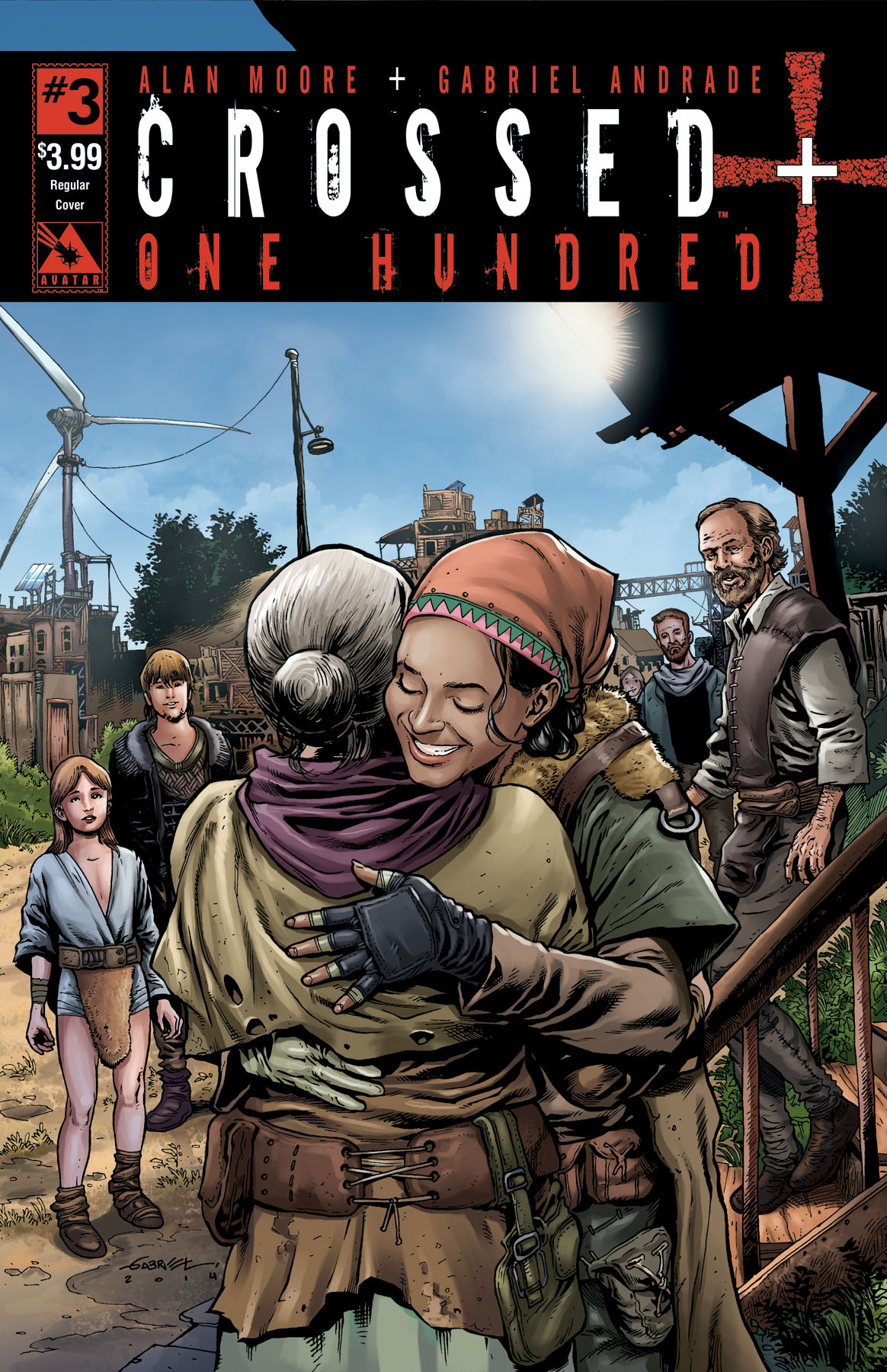 Crossed +100 #3 — Writer: Alan Moore; Art: Gabriel Andrade; Colors: Digikore Studios
Moore’s look at the Crossed world 100 years after the initial infection continues to add more information about its human society, as the survey team we’ve been following for two issues heads back to its human settlement. Technology having been pushed back to the level of the early 1800s, they travel up and down the Mississippi River in steamboats, and treat the Crossed much like early settlers treated the Indians, as enemies to be both feared and exterminated — but there’s growing evidence that the infected are more organized than they were before…. Moore might be the most intellectual writer comics has ever had, and his working out of all of this — including the changes in language wrought by a century, and eerie touches like the steamboat’s gingerly passage past ruined, still-glowing nuclear power plants on the river’s edge — is more than worth your $3.99 for this comic.
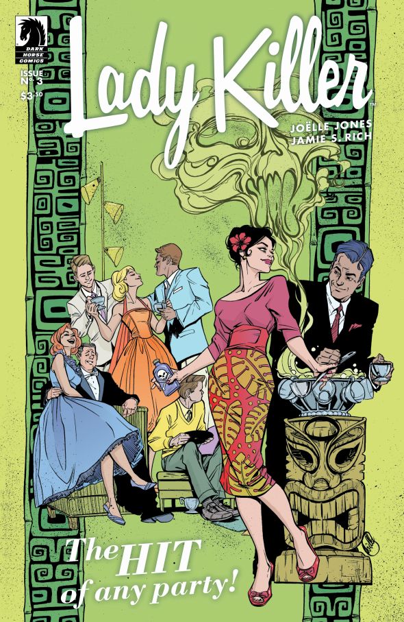 Lady Killer #3 (of 5) — Story: Joelle Jones and Jamie S. Rich; Art: Joelle Jones; Colors: Laura Allred
As with the first two issues of this series, I continue to be impressed with Joelle Jones’s art, with its fashion sense and its ability to tell a story by picking just the right angles and focus points to communicate the action; now, after three issues, I’m also appreciating her character work and plotting, as she begins to show cracks in her title character’s icy, no-nonsense composure, and the businessmen who employ her begin to see her as more of a liability than an asset (their casual sexism makes the story, set in the early ’60s, seem like Mad Men for contract killers). In an era of increasing female readership and ore and more top-tier women writers and artists, Jones is definitely a creator to watch.
 Saga #26 — Writer: Brian K. Vaughan; Art/Colors: Fiona Staples
Everyone knows the drill on this one already, right?: best-selling sf title with great characters and an exciting, galaxy-spanning plot, anchored by Staples’s art, which manages to make everything look both realistic and appealing, whether it’s dragons, convenience-store heists or robot royalty with TV heads. This issue’s definitely an in-the-middle-of-the-arc mode, so it might be better for rookies to start with the trades, and for a while it looks like it won’t have one of Vaughan’s patented OMG splash pages, but be patient: they’re just saving the shock for the very end.
 Spider-Woman #5 — Writer: Dennis Hopeless; Pencils/Colors: Javier Rodriguez; Inks: Alvaro Lopez
Rocket Raccoon #9 — Writer: Skottie Young; Art: Jake Parker; Colors: Jean-Francois Beaulieu
Avengers #42 — Writer: Jonathan Hickman; Art: Stefano Caselli; Colors: Frank Martin
Three miscellaneous Marvel books round out this week’s list: Spider-Woman, after its first few issues were tangled in the “Spider-Verse” crossover, finally gets to set its own tone, and, not surprisingly, it’s firmly in the Hawkeye/Captain Marvel/She-Hulk/Ms. Marvel/Daredevil vein: light in tone (having left S.H.I.E.L.D., Jessica 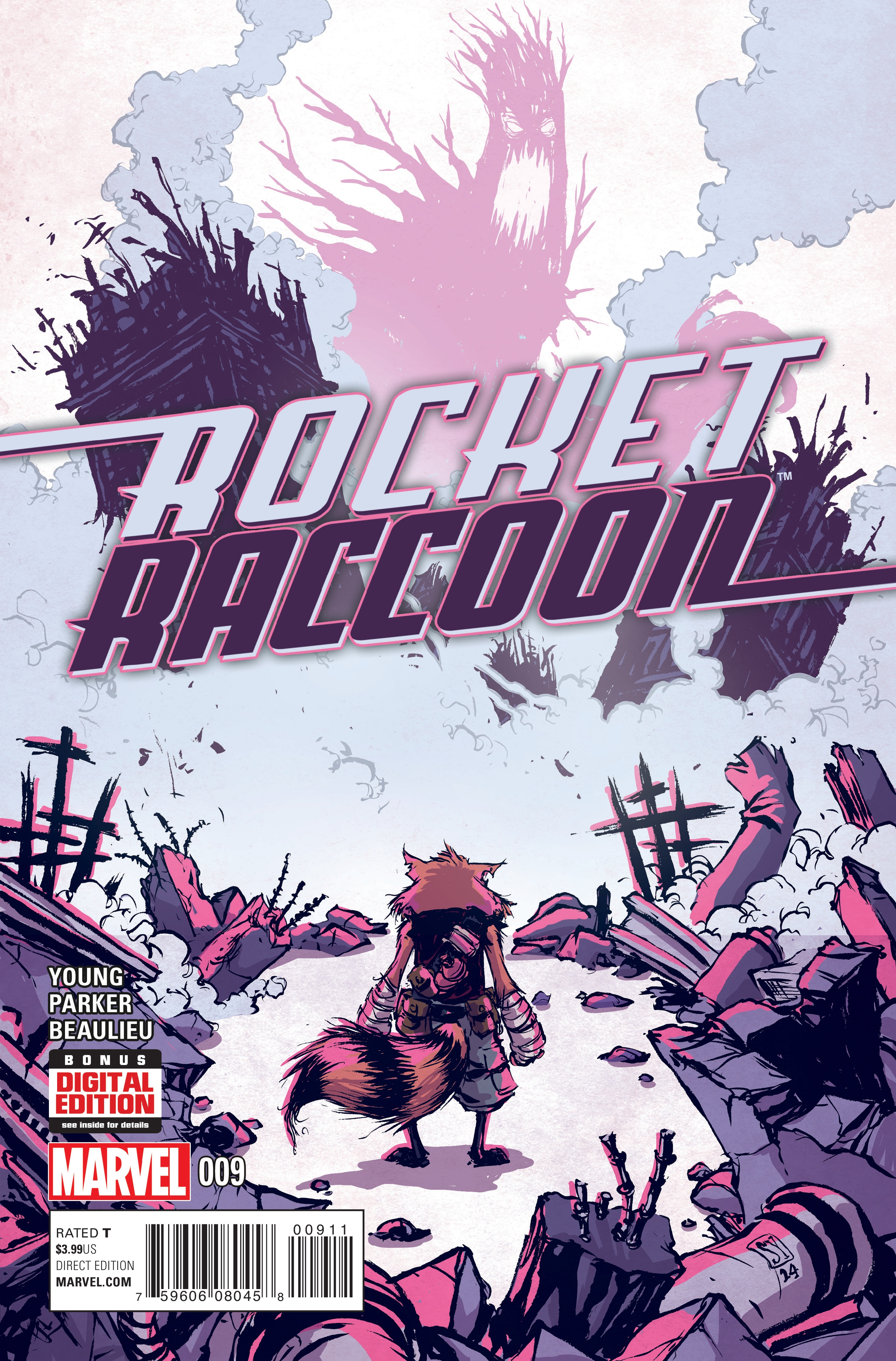 decides to fight super-villain crime, but isn’t very good at it); good-looking, brightly-colored art; appealing to new readers (she gets a new, more-practical costume and a motorcycle), but with enough continuity for older fans (among others, the Porcupine is one of the bad guys this issue, and Ben Urich shows up). It’s a good comic; let’s hope it’s able to retain a reasonably-sized audience. Rocket Raccoon has the advantage of its breakout title character, and Young, while not providing the art, continues to supply decent scripts: in this one, apparently set in the future, Groot has left Rocket years ago to go to Earth and join the Avengers, but things haven’t gone as planned, and now he’s in full monster-tree mode: but things aren’t quite what
 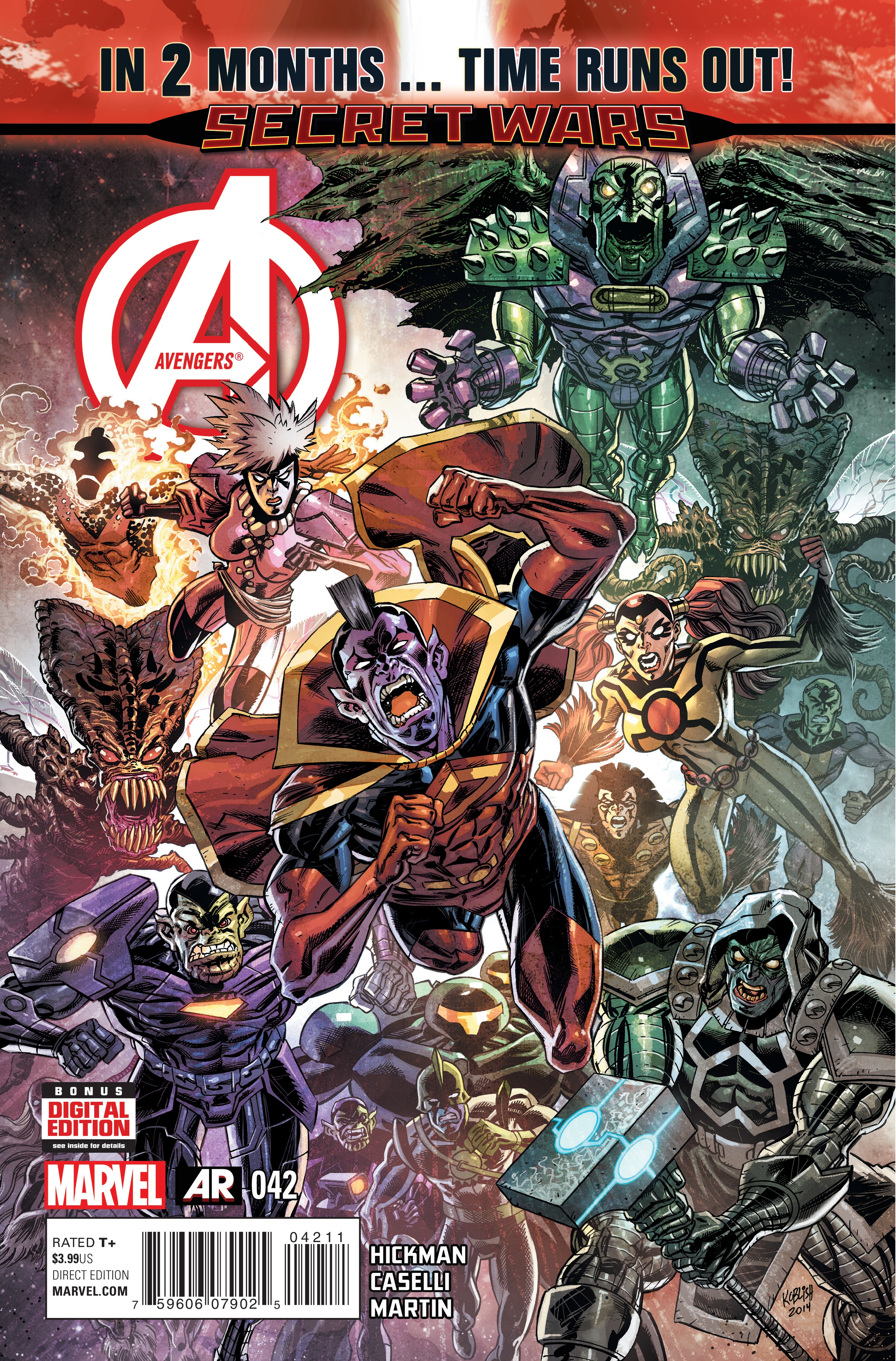 they seem…. and this turns out to be that rare modern phenomenon: a done-in-one-issue comic. Avengers is hardly that, being more of a 42-issue continuing story (not to mention its coordination with Hickman’s New Avengers; he’s basically on about chapter 75 of his vast ongoing saga right now, meant to end with Secret Wars in a few months), with a roster sheet of 44 characters at the front of the book. Good luck jumping on the roller coaster now, but for the rest of us it’s fun watching plot points planted over a year ago paying off, and seeing the whole big rattling contraption of a story round into an apocalyptic, hopefully-satisfying conclusion.