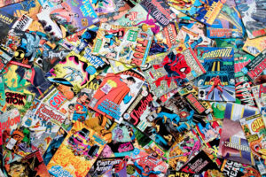
Fall of the Hulks: Gamma — Writer: Jeph Loeb; Pencils: John Romita, Jr.; Inks: Klaus Janson
Great art, with a large cast, too (both heroes and villains), as a major character “dies” (and I’m using the quotes because he’s “died” at least twice before that I can remember). Loeb, to give him credit, lets his art team carry most of the load; he throws in five full-page splashes, plus two double-page splashes, and they’re all just about pretty enough to be worth the cost of the book. Unfortunately, there’s 29 pages of story, so even with nine of them being largely-wordless splashes, that still leaves 20 pages of plot and dialog, and it’s the usual Loebian combination of jumbled chronology, nonsensical twists, and cynical manipulation of the reader. If you’re twelve, though, and easily distracted/awed by lots of kewl-looking good and bad guys (Modok! Leader! Red Ghost! Red Hulk! Red She-Hulk! Blue Rick Jones!) beating on each other (or, in this initial episode, getting ready to beat on each other), you’re likely to love this crossover.
Thor #605 — Writer: Kieron Gillen; Penciler: Billy Tan; Inker: Batt
There’s a character here who’s had her heart ripped from her chest, but a few minutes later is still alive; that’s as apt an analogy as any for this book right now: Straczynski is gone, unexpectedly, but the concepts and characters he set in motion are still spinning, still moving. It’s admittedly entertaining to watch Thor and the Asgardians against Doctor Doom, with Loki, as ever, playing both sides against the middle — but once that’s over, and Gillen and Tan have to move this book on their own, I’m predicting either a sudden collapse or a gradual wasting away, and neither one’s going to be much fun to watch.
Image United #2 (of 6) — Writer: Robert Kirkman; Layouts: Eric Larson; Art: Larsen, Liefeld, McFarlane, Portacio, Silvestri and Valentino
Like the first issue, this is nothing but a bunch of fight scenes strung together with portentious dialog and Scotch tape, with a huge cast of characters that no one cares about. The art, of course, is all over the place; since there’s no actual story, the reader is left to look at it, and note that, of all the original Image creators, only Eric Larsen (who’s actually been drawing a monthly book for the last 15 years) has grown into a smooth superhero artist, despite all his Kirby riffs; everyone else is using the same combination of lazy page design, multiple gritted-teeth close-ups, bad anatomy and sketchy rendering that they were using back in the ’90s. One-third of the way in, this mini-series is a train wreck, and the odds of it getting back on the tracks are roughly the same as Liefeld suddenly being able to draw human-looking feet (or hands, or musculature, or recognizably human facial expressions other than “constipation,” or…).
Iron Man Vs. Whiplash #2 (of 4) — Writers: Brannon Braga and Marc Guggenheim; Artist: Phillippe Briones
Exhibit A: Tony, framed for mass murder, is rotting in prison along with a bunch of other terrorists (we’re told this is the place they’d put Bin Laden in if they caught him). So, the bad guy, dressed in his modified Stark whiplashy hardware, busts in to kill him, and Tony grabs a guard’s gun and shoots the armor, and it completely freezes up. Why? Thought balloon from Tony: “Never did get around to fixing the Type 4’s stabilization module. Hit it hard enough, the whole damn system freezes up until reboot.” Think that’s convenient? Wait, there’s Exhibit B: Tony in this big prison for terrorists, and yet he’s been able to smuggle enough metal and electronics into his cell (pots and pans from the kitchen, a motor from a washing machine, etc.) to make an entire Iron Man suit, and hide it in his cot. His ability to do this is explained in another thought balloon: “It’s ironic — but lucky — that a prison which houses war criminals isn’t exactly maximum security.” Um, yeah: “lucky” in this case meaning “the writers are lazy hacks, and have complete contempt for any readers who would spend money on crap like this.”
Archie #604 — Writer: Michael Uslan; Pencils: Stan Goldberg; Inks: Bob Smith
This is the second of the three-part “If Archie Married Betty” story, and, no surprise, things are turning out just as well for our plucky lovebirds as they did in the Archie-Veronica tale, albeit by a different, and more rocky, path (although I suspect most women won’t be very amused by the way Betts gives up a promising New York career for her bumbling, socially-inept lesser half). As with the earlier story, seeing Goldberg’s versions of the cast as late-twenty-somethings, with fuller faces and figures, is just… weird, but there’s something oddly reassuring about the Archieverse idea that, somehow, everything in life will settle into place, and that hard work, love and earnestness will always be enough to conquer whatever the world throws at you.
Punisher #12 — Writer: Rick Remender; Art: Tony Moore
There’s been an interesting debate about the “FrankenCastle” direction this book has taken; the letters page this issue duplicates the “pro” side, which argues that, in the Marvel Universe, of course anything is possible (cosmic silver guys on surfboards, etc.), so why not? Yes, but the Punisher’s shtick has always been his relatively-gritty reality; attempts to make him otherwise (an avenging angel of the Lord, say) have always foundered. That said, this is a noble attempt, because (a) Moore’s art is very clean and offbeat, and he’s great at drawing monsters, and (b) Remender’s story and dialog are so over-the-top that they’re able to mix a welcome sense of fun and excitement in with the general gloom and doom. I still don’t think it’s going to be able to work more than six issues without collapsing under its own improbability, but at least give everyone points for not spooning up the same old stuff.
Fantastic Four #574 — Jonathan Hickman; Pencils: Neil Edwards; Inks: Andrew Currie
If Fall of the Hulks: Gamma has good art and bad story, this suffers from the reverse: Hickman has settled in nicely over the last few issues, providing both cosmic multiversal romps (the Legion of Extraordinary Reeds) and small family moments (as in Franklin’s birthday party here); his treatment of Valeria as a spooky-but-grounded five-year-old prodigy has been particularly good. However, Edwards as artist is disastrous: his Reed is clunky and awkward, with none of the grace and absent-minded, startling fluidity that should define the character, and he draws Valeria like a 40-year-old midget. Yes, he’s OK with costumed super-characters, but not with anything else, and that lack of visual chops drags the whole book down.
Gotham City Sirens # 7 — Writer: Paul Dini; Penciller: David Lopez; Inker: Alvaro Lopez
I’ve decided that Paul Dini’s problem is steady work: the more frequently he has to write, the worse his stories are. When he was just doing the occasional one-shots, like Mad Love, they were great. Even when he was doing, say, two out of every four issues of Batman, he was able to deliver effective one-shot episodes. Countdown, though, was both a weekly comic and a total mess, and this monthly book is, while not that bad, no more than mediocre: witness this issue, where the girls split up for Christmas, each have maybe half an adventure, and then come back together as if nothing has happened. That’s because it hasn’t; add middling art to the practically nonexistent story, and you’ve got a comic with no reason to exist. Merry Christmas, readers!
Phil Mateer